We have published another couple of updates and fixes for Budget as we took another look at the projections and monthly totals.
Projections
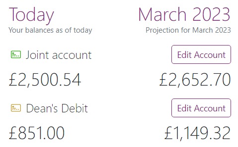
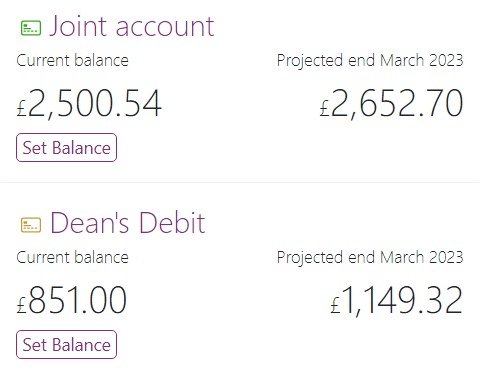
We weren’t happy with our previous tweak so we had another go. The “Edit account” button didn’t seem in the right place and it felt like the dates and balances were not aligned.

(Numbers are for example only)

(Numbers are for example only)
Expenses per category
Below each month we have added a visual overview of the category splits for all your expenses. The ideal goal is 50% fixed expenses, 30% flexible expenses and 20% savings/pension – the little indicator gives you an idea of where you are.
Expense & Income per account
We have updated the total expenditure and income totals for each month. Rather than a single total value, we now provide a total per account and if there is more than one account, there is an overall total. The goal is that this should make it simpler to work out the budgeting requirements for each of your accounts.
Fixes
- We have fixed the navbar on all content pages, the menu should be in line with the logo.
- We have tweaked the Budget overview search when you type fewer than three characters.